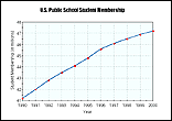
Thursday, we discussed drawing logical conclusions from our data.
Remember, the dependent variable is what is measured as a result of changing the independent variable (what you're testing). For example, the air temperature depends on the time of day, so the air temperature is the dependent variable and plotted on the y-axis.
The time of day is changing so this is an independent variable on the x-axis.
When there is a cause and effect relationship between the two variables a line graph will result from plotting the data.
IF there is a directly proportional connection between the dependent and independent variable, what kind of line does your graph make?
What can you logically conclude by looking at the graphs?
Your notes on conclusion writing should be on p.47 in your notebook and the practice sheet Cause and Effect/Drawing Conclsuions will go next to it on page 46 in your IAN.
The Friday Quiz will be on graphing and the vocabulary in scientific inquiry.

No comments:
Post a Comment